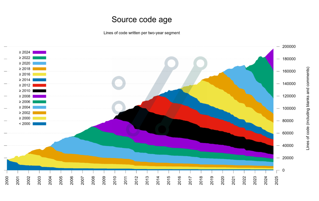
It’s a relaxed Saturday afternoon, and I just remembered some nerdy plots I’ve seen online for various projects, depicting “code age” over time: how does your repository change over the months and years, how much code still survives from the beginning till now, etc… Something like this made by the author of curl:

It looks interesting and informative. And even though I don’t have codebases that have been around this long, there are plenty of codebases around me that are fast moving, so something like a month (or in some cases week) level cohorts could be interesting.
One way to take this challenge on is to actually sit down and write the code. Another is to take a Large Language Model, say Claude and try to get that to make it. Of course the challenge is different in nature. For this case, let’s put myself in the shoes of someone who says
I am more interested in the results than the process, and want to get to the results quicker.
See how far we can get with this attitude, and where does it break down (probably no spoiler: it breaks down very quickly.).
Note on the selection of the model: I’ve chosen Claude just because generally I have good experience with it these days, and it can share generated artefacts (like the relevant Python code) which is nice. And it’s a short afternoon. :) Otherwise anything else could work as well, though surely with varying results.
Version 1
Let’s kick it off with a quick prompt.
Prompt: How would you generate a chart from a git repository to show the age of the code? That is when the code was written and how much of it survives over time?
Claude quickly picked it up and made me a Python script, which is nice (that being my day-to-day programming language). I guess that’s generally a good assumption these days if one does data analytics anyways (asking for another language is left for another experiment).
The result is this this code. I’ve skimmed it that it doesn’t just delete all my repo or does something completely batshit, but otherwise saved in a repo that I have at hand. To make it easier on myself, added some inline metadata with the dependencies:
# /// script
# dependencies = [
#   "pandas",
#   "matplotlib",
# ]
# ///
and from there I can just run the script with uv.
First it checked too few files (my repository is a mixture of Python and SQL scripts managed by dbt), so had to go in and change those filters, expanding them.
Then the thought struck me to remove the filter altogether (since it already checks only files that are checked in git, so it should be fine – but then it broke on a step where it reads a file as if it was text to find the line counts. I guess there could be a better way of filtering (say “do not read binary files”, if there’s a way to do that), but just went with catching the problems:
# ....
    for file_path in tracked_files:
        try:
            timestamps = get_file_blame_data(file_path)
            for timestamp in timestamps:
                blame_data[timestamp] += 1
                total_lines += 1
        except UnicodeDecodeError:
            print(f"Error reading file: {file_path}")
            continue
#....
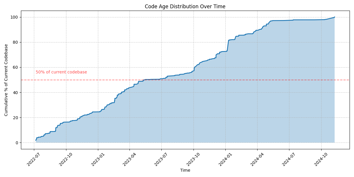
(hance I know that a favicon PNG was causting those UnicodeDecodeError hubbub in earlier runs. Now we are getting somewhere, and we have a graph like this:

This is already quite fun to see. There are the sudden accelerations of development, there are the plateaus of me working on other projects, and generally feel like “wow, productive!” (with no facts backing that feeling 😂). Also pretty good ROI on maybe 15 mins of effort.
Having said that, this is still fair from what I wanted.
Version 2
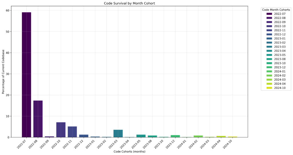
Promt: Could we change the code to have cohorts of time, that is configurable, say monthly, or yearly cohoorts, and colour the chart to see how long each cohort survives?
This came back with another set of code. Adding the metadata, skimming it (it has the filter on the file extensions again, never mind), and running it once more to see the output, I get this:

Because of the file extension filter in place, the numbers are obviously not aligning with the above, but it does something. The something is a bit unclear, bit it feels like progress, so let’s give it a benefit of the doubt, and just change once more.
Version 3
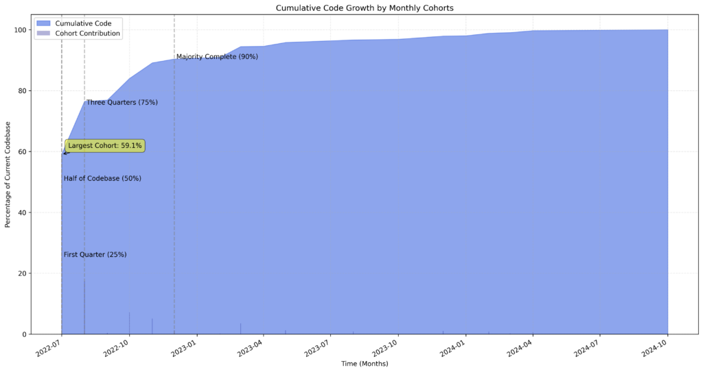
Promt: Now change this into a cummulative graph, please.
One more time Claude came back with this code. Adding the metadata again, same drill. Running this has failed with errors in numpy, though:
TypeError: ufunc 'isfinite' not supported for the input types, and the inputs could not be safely coerced to any supported types according to the casting rule ''safe''Now this needed some debugging. It turns out a column the code is trying to plot is actually numbers as strings rather than numbers as, you know, say floats…
# my "fix"
        df['cumulative_percentage'] = df['cumulative_percentage'].astype(float)
# end

        # Plot cumulative area
        plt.fill_between(df.index, df['cumulative_percentage'],
                        alpha=0.6, color='royalblue',
                        label='Cumulative Code')
It didn’t take too many tries, but it was confusing at first – why shouldn’t be, if I didn’t actually read just skim the code…
The result is then like this:

Sort of meh, it feels like it’s not going to the right direction overall.
But while debugging the above issues, I first tried tried to ask Claude about the error (maybe it can fix it itself), but came back with “Your message exceeds the length limit. …” (for free users, that is). So I kinda stopped here for the time being.
Lessons learned
The first lesson is very much re-learned:
Garbage in, garbage out.
If I cannot express what I really want, it’s very difficult to make it happen. And my prompts were by no means expressing my wishes correctly, no wonder Claude wasn’t really hitting the mark. Whether or not a human engineer would have faired better, I don’t know. I know however, that this kind of “tell me exceedingly clearly what’s your idea” is an everyday conversation for me as an engineer (and being on both end of the convo).
The code provided by the model wasn’t really far off for some solution, so that was fun! On the other hand, when it hit any issues, I really had to have domain and language knowledge to fix things. This seems like an interesting place to be:
- the results are quick and on the surface good-enough for a non/less technical person, probably
- but they would also be the ones who couldn’t do anything if something goes wrong.
Even myself I feel that it would be hard to support the code as a software engineer if it was just generated like this. But that’s also a strange thought: so many times I have to support (debug, extend, explain, refactor) code that I haven’t had anything to do with before.
It seems to me that now that since Claude comes across as an eager junior engineer, writing decent code that always needs some adjustments, the trade-off is really in the dimension of spending time to get better at prompting vs better at coding.
If there’s a person with some amount of programming skills, mostly interested in the results not the process, and doubling down on prompting: they likely could get loads further than I did here. Good quality prompts and small amount of code adjustments being the sweet spot for them.
For others who have more programming expertise, and maybe more interested in the process, spending time on getting better at programming rather than getting really better at prompting: keeping to smaller snippets might be the sweet spot, or learning new languages, … Something as a starting point for digging in, a seed, is what this process can help with.
Future
Given the above notes on how this generated code is like a new codebase that I suddenly neet to support, here’s a different, fun exercise 💡 to actually improve engineering skills:
Take AI generated code that is “good enough” for a small problem and refactor, extent, productionise it.
I’m not sure if this would work, or would get me into wrong habits, but if I wanted do have some quick ways of doing deliberate practice – and not Exercism, LeetCode, or somilar, rather something that can be custom made, then this seems a way to get started.
Also, now that I’ve gotten even more interested in the problem, I’ll likely just dig into how to actually define that chart I was looking for and what kind of data I would need to get from git to make it happen. The example code made me pretty confident, that “all I need is Python” really, even though while prepping for this I found other useful tools like one allowing you to write SQL queries for your repo, that might be some further way to expand my understanding.
Either way, it’s just fun to mess with code on a lazy Saturday.
